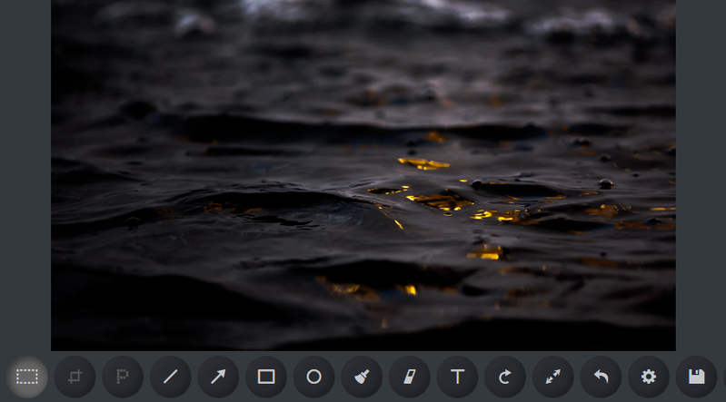
Painterro dark theme
First, we are initializing Painterro js paint:
| Painterro({ | |
| toolbarHeightPx: 54, | |
| buttonSizePx:42, | |
| backgroundFillColor: '#222', | |
| }).show() |
Now some CSS (we recommend CSS preprocessor, but for best compatibility, here I will show just a simple CSS):
| .ptro-holder { | |
| bottom: 32px; | |
| } | |
| .ptro-icon-btn[class] { | |
| border-radius: 27px; | |
| background-color: #272a2f; | |
| box-shadow: inset -1px -1px 8px 1px rgba(0, 0, 0, 0.7); | |
| position: relative; | |
| color: #c4c8cb; | |
| } | |
| .ptro-icon-btn[disabled] { | |
| color: #575757; | |
| } | |
| .ptro-icon-btn:not([disabled]):hover[class] { | |
| background-color: #233 !important; | |
| color: #c4c8cb !important; | |
| } | |
| .ptro-color-active-control[class] { | |
| background-color: #656565; | |
| box-shadow: inset 1px 1px 8px 1px rgba(0, 0, 0, 0.7); | |
| } | |
| .ptro-color-active-control[class]::after { | |
| box-shadow: inset -1px -1px 8px 1px rgba(255, 255, 255, 0.1); | |
| } | |
| .ptro-icon-btn::after { | |
| content:''; | |
| width: 100%; height: 100%; | |
| border-radius: 27px; | |
| position: absolute; | |
| box-shadow: inset 1px 1px 8px 1px rgba(255, 255, 255, 0.1); | |
| } | |
| .ptro-color-main[class] { | |
| background-color: #34393d; | |
| } | |
| .ptro-wrapper[class] { | |
| background-color: #34393d; | |
| } |
And result: