Chaining animations in transitions
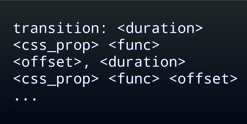
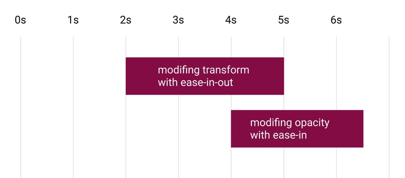
Did you know that the transition CSS property has the ability to define the sequence of animations via comma:
transition: transform 3s ease-in-out 2s, opacity 4s ease-in 2.5s;
Here is a real-world example:
HTML:
| <div id="hover-me"> | |
| <div class="animate-me"> | |
| <div class="rotate-animate-me"></div> | |
| </div> | |
| </div> |
CSS:
| #hover-me{ | |
| position: absolute; | |
| top:50%; | |
| left: 50%; | |
| width: 50px; | |
| height: 50px; | |
| transform: translate(-50%, -50%); | |
| background: #f00; | |
| } | |
| .animate-me{ | |
| width: 100%; | |
| top: 0%; | |
| left: 0%; | |
| height: 100%; | |
| transform: scale(1); | |
| pointer-events: none; | |
| } | |
| .rotate-animate-me{ | |
| width: 100%; | |
| top: 50%; | |
| left: 50%; | |
| height: 100%; | |
| pointer-events: none; | |
| background: #00f; | |
| position: absolute; | |
| transform: translate(-50%,-50%) rotate(0deg); | |
| transition: width 0.5s ease-in-out 0.1s, height 0.5s ease-in-out 0.1s; | |
| } | |
| #hover-me:hover .animate-me{ | |
| position: absolute; | |
| top: -200%; | |
| left: -200%; | |
| margin-left: 200px; | |
| transform: scale(2); | |
| transition: left 1s ease-in-out, top 1s ease-in-out 1s, transform 1s ease-in-out 3s, margin-left 1s ease-in-out 4.5s; | |
| } | |
| #hover-me:hover .rotate-animate-me{ | |
| background: #f0f; | |
| transform: translate(-50%,-50%) rotate(2700deg); | |
| width: 0; | |
| height: 0; | |
| transition: background 1s ease-in-out 2s, transform 2s ease-in-out 4s, width 1s ease-in-out 6s, height 1s ease-in-out 6s; | |
| } |
Here how it looks: